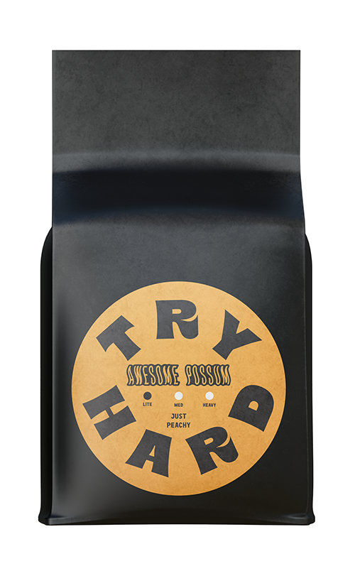
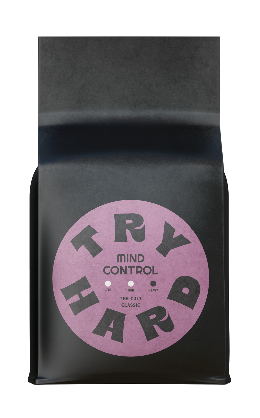
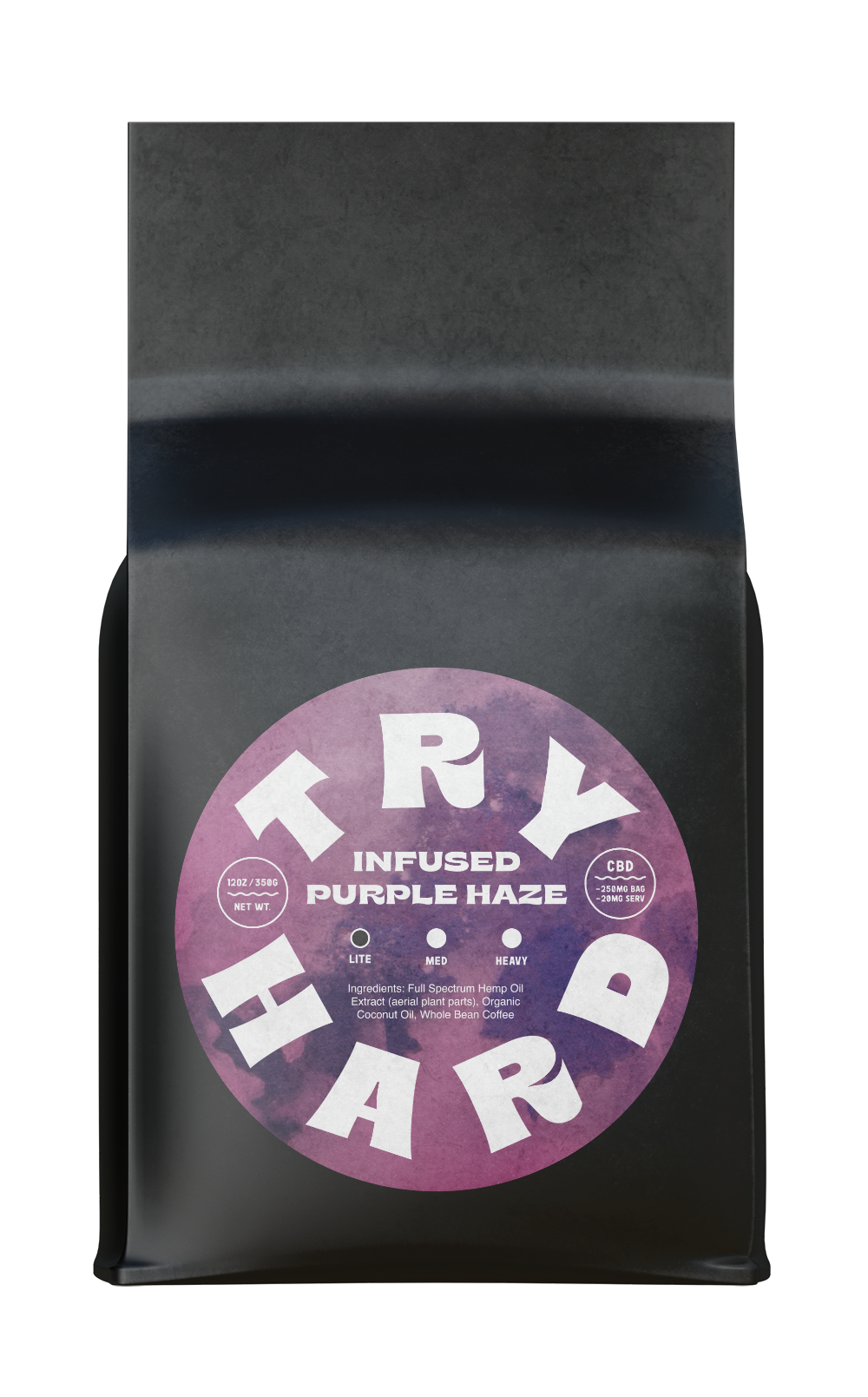
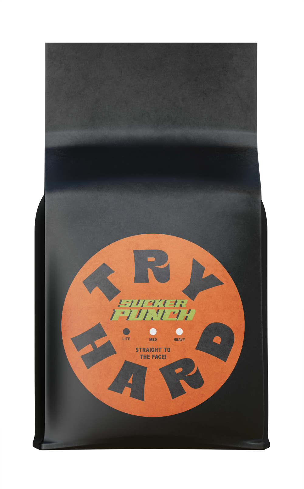
Try Hard lived in a building that was a taxi fueling station, then a queer nightclub, and finally a french bistro on the east side of Austin. The main font for Try Hard is a customized version of Bryce— a vintage/retro choice. Influenced by vintage gas station stickers my dad collected as a child, the stacked logo form uses a chevron pattern in faded rainbow colors— a signal to the queer community as a safe space.
Logos & Identity
Try Hard Coffee Roasters

Founded in 2020, Try Hard embodies “old Austin weirdness” and the owner’s love for local music while paying homage to the shop’s East Austin location.
Scope: brand identity, pitch deck, merchandise, D2C storefront